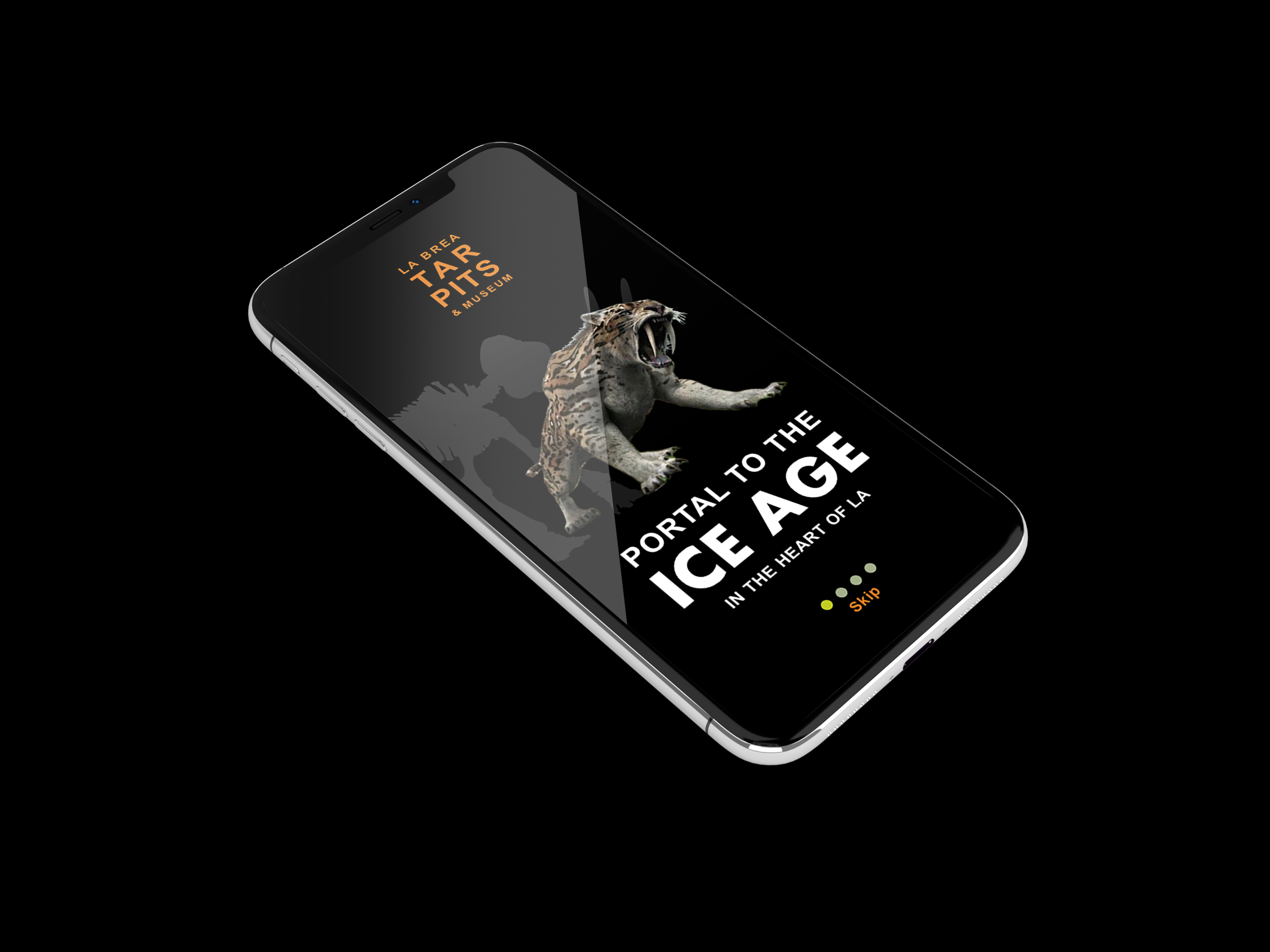
La Brea Tar Pits
Role: UX/UI Designer
About the Client:
Located in the heart of metropolitan Los Angeles, the La Brea Tar Pits are one of the world’s most famous fossil localities. The La Brea Tar Pits Museum displays Ice Age fossils — including saber-toothed cats, dire wolves, and mammoths — from 10,000 to 40,000-year-old asphalt deposits. Visitors can also watch the processes of paleontology unfold. Every day inside the glass-enclosed Fossil Lab, scientists and volunteers prepare fossils including “Zed,” a recently discovered male Columbian mammoth.
The Challenge:
Design an MVP that delights the visitors with an engaging, educational and cohesive narrative utilizing current and future technologies while maintaining the integrity of the institution’s history.
Consider new tech - Augmented Reality
Design mobile app
Onscreen map
Zoom in on key exhibit pieces that cannot be touched by public
Tools:
Sketch
Invision Studio
Google Suite
Pencil & Paper
Whiteboards
Post-It Sticky Notes
Real Time Board
The Team:
Eric Sarmiento
Rachel Duetsch
Savannah Holcomb
Duration:
2 Week Sprint
- Discovery -
Research
We wanted to see how institutions like The Broad, The Museum of Natural History, and others captivate their users with new technologies to convey their stories; with this in mind, we carried out a comprehensive competitive and comparative analyses.
We saw that many were using Augmented Reality as part of the exhibits or as a key feature of their museum companion apps. We also looked at educational apps utilizing new technology -- many of which integrated AR.
Additional research uncovered a news article stating that the Assistant Curator to the La Brea Tar Pits, Dr. Emily Lindsey, is in the midst of a research grant with USC about the effectiveness of Augmented Reality as a teaching tool. She granted us an interview in which she shared some of their initial findings, as well as some of the museum’s larger concerns about how visitors experience and understand the pits and museum.
We were also able to interview Guest Relations to reaffirm the museums' needs along with gather available demographic details.
Visitors didn’t realize the La Brea Tar Pits and Paleontology lab in the museum were real or important
One of the largest challenges is conveying the nature of deep time to visitors
Initial AR research says it’s an effective educational tool
Though the museum’s hesitant to use technology on its exhibits without solid evidence, because they are afraid of ruining the integrity of their history (confirmed the challenge from our brief)
Main visitors are from abroad (Languages: English, Spanish, Mandarin Chinese)
Otherwise, repeat local visitors bringing their families.
“The only paleontological field site that’s also a public experience”
The first paleontological lab open to the public
While at the museum, we interviewed 10 visitors which gave us great insight as to visitor…
Motivations
Expectations
Likes & dislikes about the museum
Feelings towards tech and potential museum integration
We also conducted multiple sessions of contextual inquires along with observing families interacting with the exhibits to…
Gather insight towards opinions and actions while navigating the museum without direction.
- Define -
Synthesize
Gathering these insights, we commenced the construction of like themes, ideas, and trends to form our of our affinity map.
Main takeaways:
We validated visitors did not know the importance, relevance, or the fact that the museum and its excavations are real and ongoing.
Visitors loved the ability to interact with exhibits, the visuals, and seeing the scientific process unfold.
People would be open to tech, more specifically, a museum companion app as long as it is educational, meaningful, & not a distraction.
Referencing our brief and knowing we wanted to integrate augmented reality, we created a matrix arranging them according to how much value they might add to a user’s experience of the museum and how complex they would be to implement.
Through this process of feature prioritization, we were able to nail down our focus for the MVP.
For our two week sprint, we wanted to address some of the concerns noted by the museum as well as build an MVP that we felt would help tackle user pain points. Our goals:
Create an educational and meaningful experience as per user comments.
Connect the inside and outside of the museum to provide more context.
Contextualize the history of the site (and size of the underground oil-field in Rancho La Brea).
Strike a balance between engaging with technology while encouraging users to be present.
Based on our user insights we compiled, we created our persona Susan to represent users frustrations and goals. This allowed us to tell Susan’s story about her “experience” at the La Brea Tar Pits.
Scenario: Susan’s plans to pick up her Mother from the airport on Sunday morning fall through due to a flight delay. Susan decides to take her daughters to the La Brea Tar Pits to kill some time. At the museum, Susan is excited to read all the plaques and information, but her daughters drag their feet behind her. They don’t have an interest in learning about the tar pits and Susan Struggles to spark their interest.
Through the visual aid of the journey map, we’re better able to convey the struggle Susan is having engaging her daughters and the exhibits.
Problem Statement:
A Susan, who feels disappointed that her kids don’t understand the importance and relevance of LTP today, needs to help her kids imagine Ice Age LA, but the museum’s dated exhibits don’t inspire them to learn.
How might we:
Help Susan engage her kids using technologies that they already use to imagine Ice Age Los Angeles and understand the importance and relevance of the La Brea Tar Pits today?
- The Pivot -
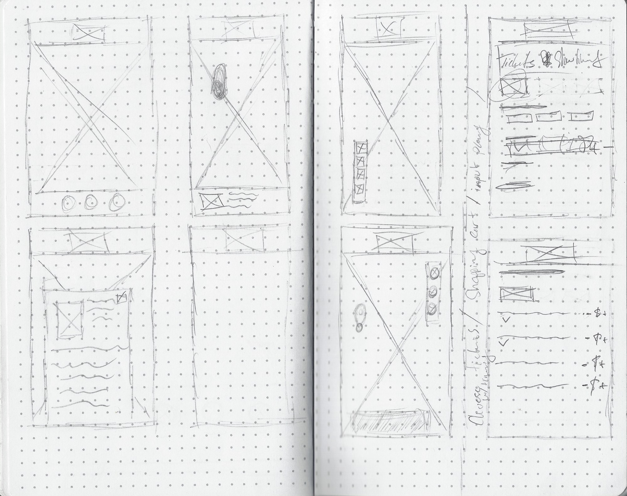
Originally we were designing and planning on having the ability to purchase tickets through the app as the primary focus while having the AR as a secondary feature and had designed a whole user and checkout flow. However, after creating a paper prototype and conducting usability tests, we found that the ticket checkout flow didn’t address the brief or support our research by creating a delightful and engaging experience. Users noted that they wanted a more fun and interactive experience noting specifically, the potential of adding gamification elements to our AR feature. This realization made us reevaluate our direction and how we were to utilize AR more effectively within our MVP.
I had made the suggestion to consider gamification elements to help engage users prior to our testing, but neither my team or the initial research supported the idea. This was mainly because users weren’t sure what to expect from a museum app experience and the museum staff weren’t sure how to integrate technology in the first place. After the learning from the paper prototyping sessions, we decided to use it as an opportunity with the how users would interact with exhibits via our app.


- Develop -
Getting our thoughts together after our rounds of paper prototyping, we re-kicked off our development phase, which began by white boarding a potential user flow that Susan would go through while using the app. Again, keeping in mind what we learned from testing, we discovered steps/pages that we had not considered which helped shape the flow moving forward.
For example:
Allow app to access camera
Highlight AR areas on map
Add prompt to connect outside interactions with inside of museum


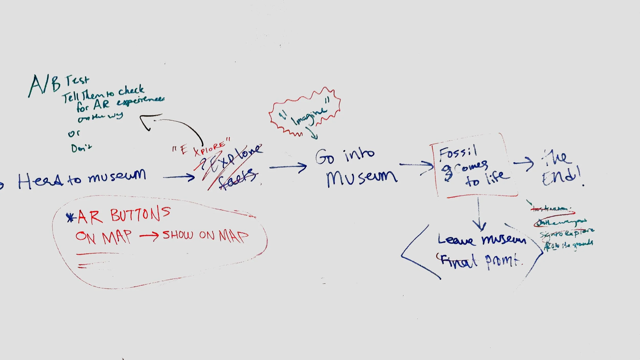
Ultimately, we designed around the following user flow…
Ideation & Design
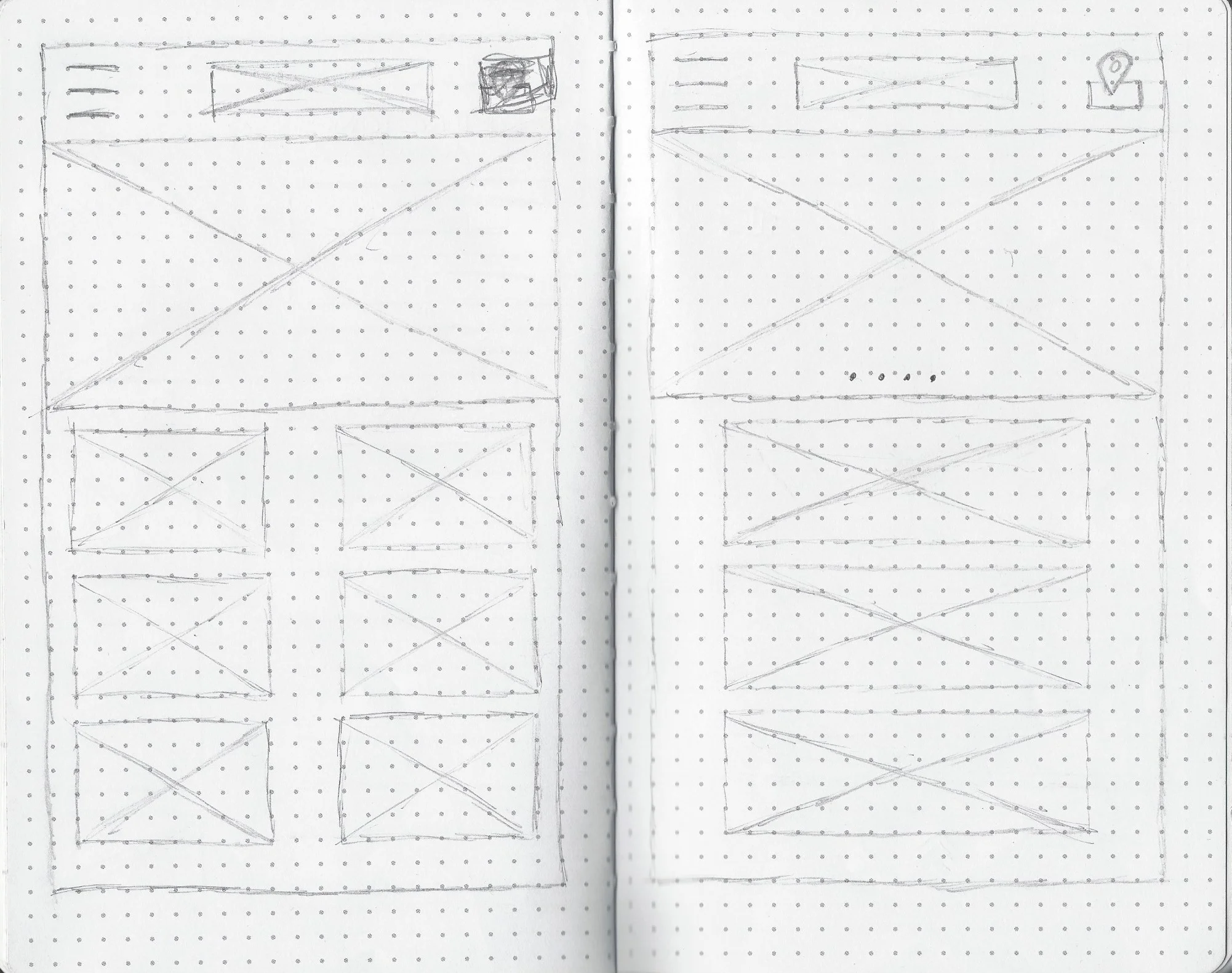
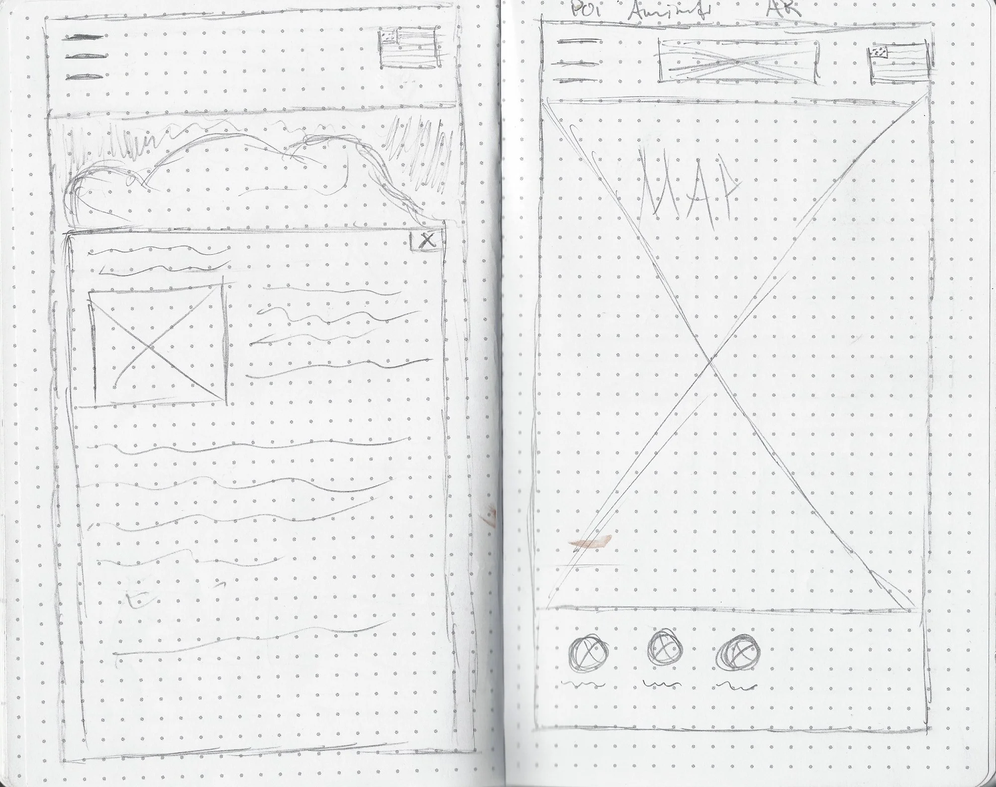
Holding multiple time-boxed design studio sessions, we each sketched out layout ideas of the key pages that we were to include in our MVP while also considering pages we had sketched out previous to our pivot. After reviewing all the sketches, we identified our favorite design elements we wanted to move forward with and used one of my designs for the home page while then grabbing ideas from everyone’s sketches to design the rest of the screens.
Digitizing Sketches
We then transitioned from pen and paper to Sketch and created a medium-high fidelity flow to prepare for testing as quickly as possible. Considering our deadline, we wanted to ensure that if there were any issues or updates we needed to make, we would have sufficient time to do so.
- Deliver -
Build, test, iterate…
Our delivery phase consisted of:
Building the prototype
Usability Testing
Refine Design
Prototyping
With a majority of the wireframes ready for testing, I created the iOS prototype using Invision Studio. After 3 rounds of testing on medium-high fidelity, we narrowed down the main points of improvement and I created our final high fidelity prototype. One more usability test confirmed that users were able to follow the intended flow.


